Created as Lead Designer on this project at MATTA
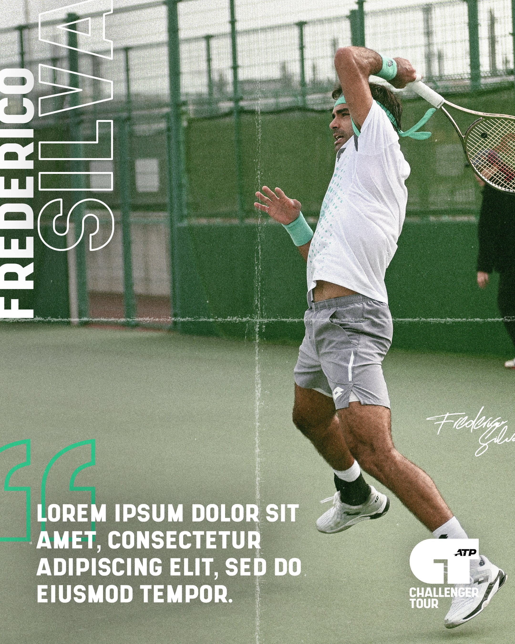
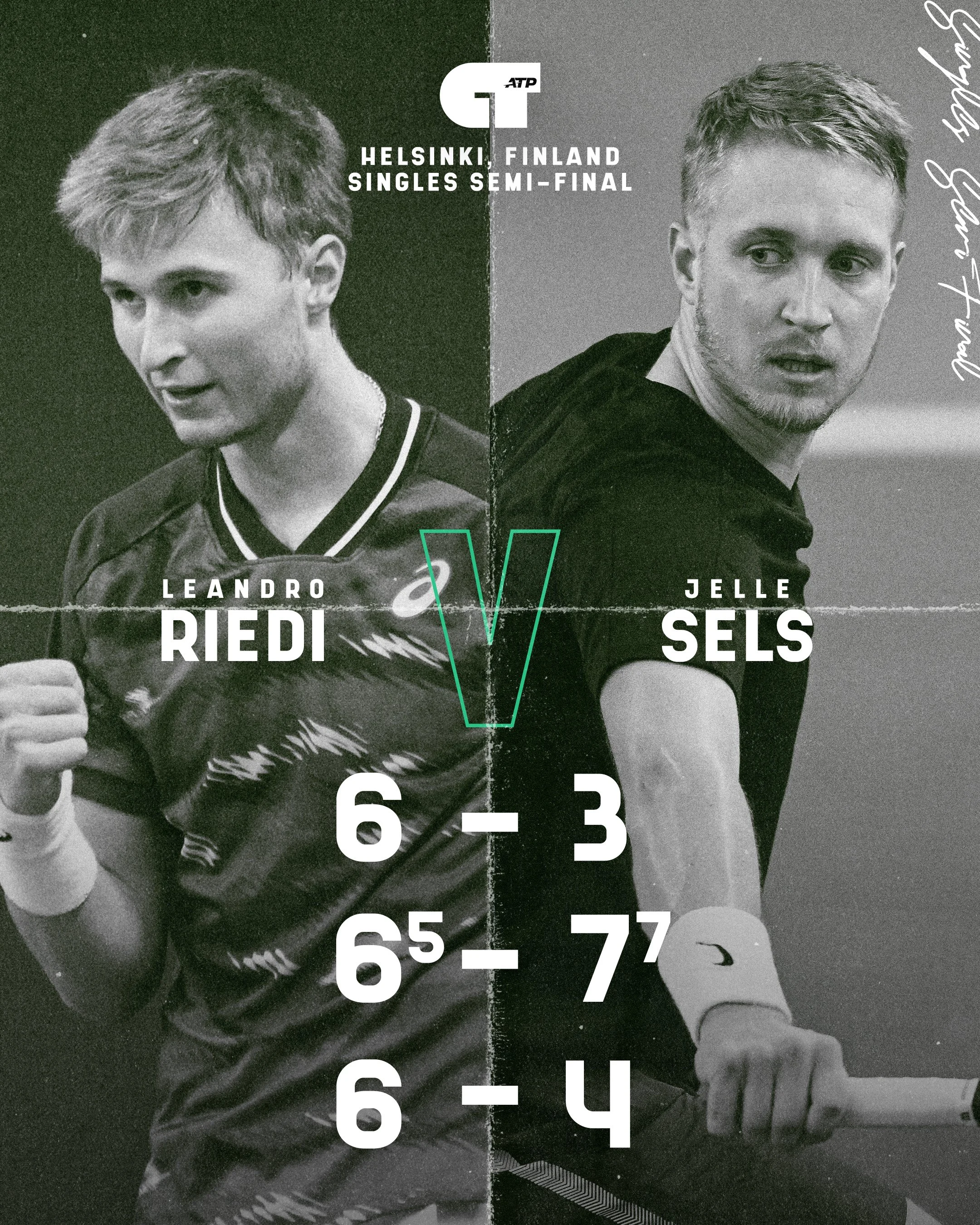
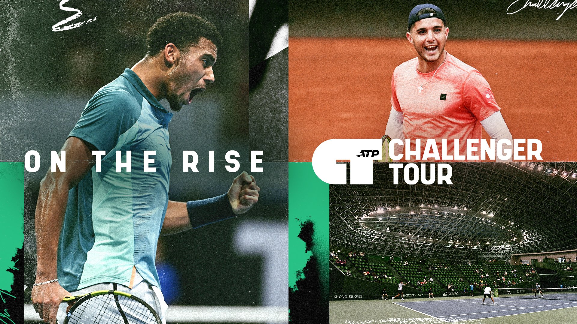
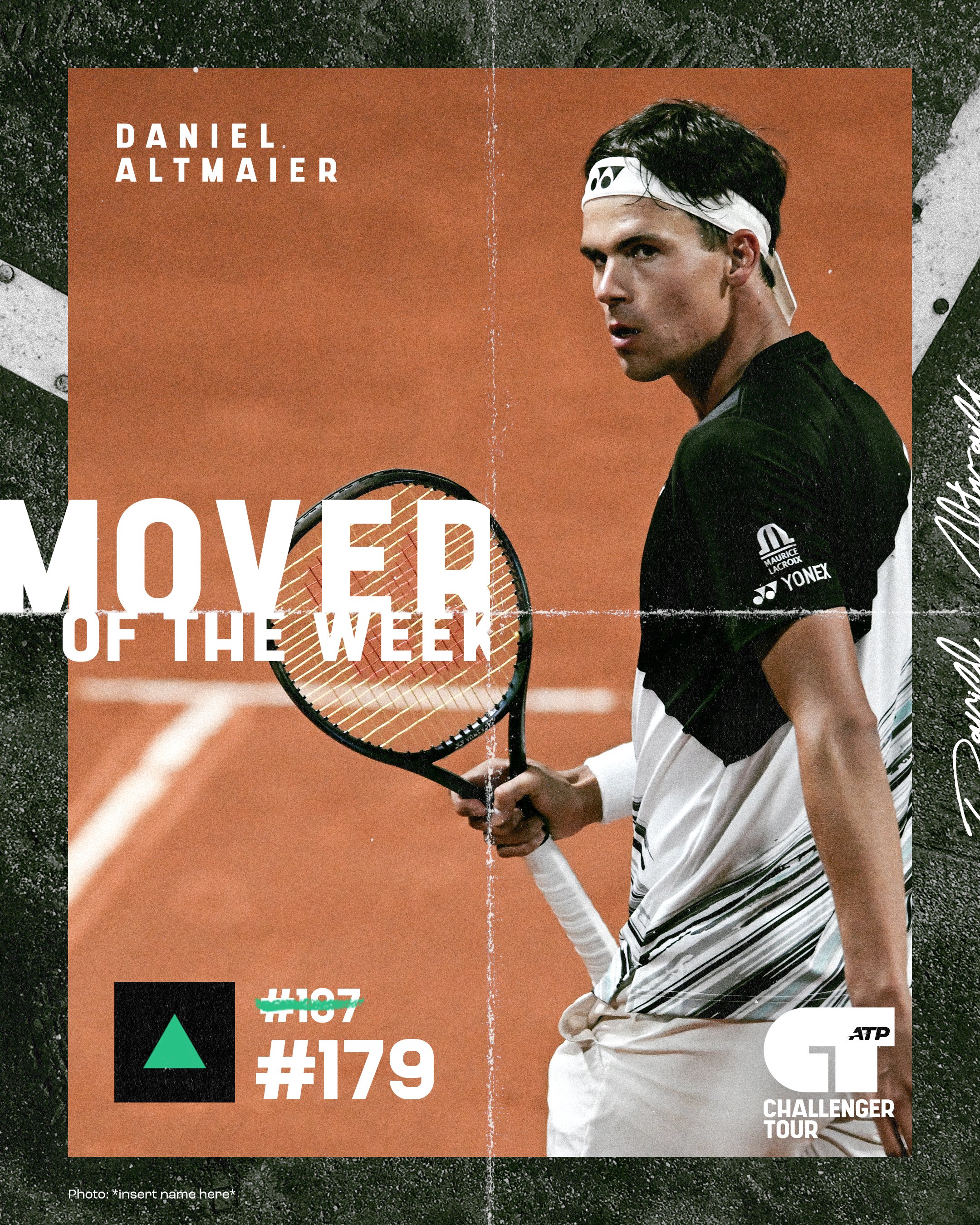
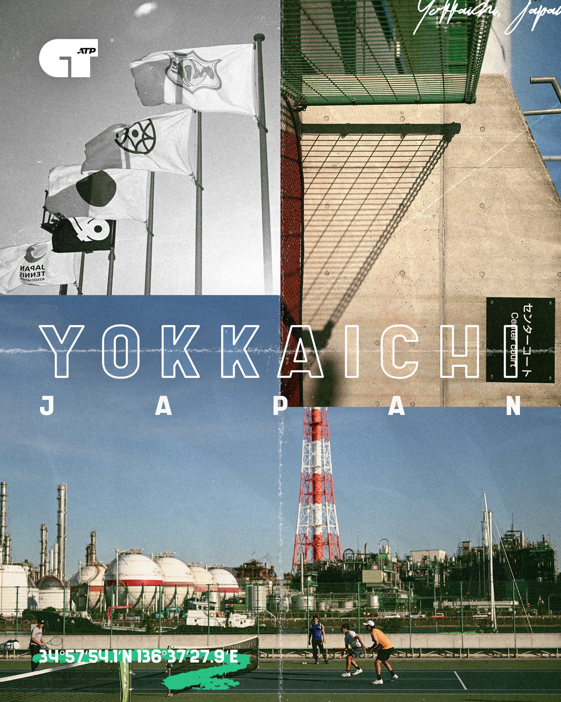
Modernising the brand for the ATP Challenger Tour - the second tier of men’s professional tennis

Whilst the client created the new logo in house, I built the supporting brand world including extensive brand guidelines, social templates, launch assets and a ready to use toolkit including custom typography, colour palette, and a library of textures, many of which I created by hand.

Typography system
As a tournament that features up and coming players, often without the glitz and glamour of the main ATP Tour, the brand needed to feel down to earth, gritty and raw. The use of grain, texture, and desaturated images conveys that alongside the energy and youthful energy of the typography.


Hand drawn charcoal textures

Image treatment