easyJet
I was recently boarding a flight when an easyJet plane on the tarmac caught my eye. The logo - seemingly not refreshed in the airline’s 30 year history - immediately transported me back to the early ‘00s, watching angry late arrivers losing their temper in the TV show Airline. In that moment I became very aware of the potential need for a bit of a makeover.
The one thing I definitely did not want to lose was the brand’s relationship with the colour orange. easyJet have sole ownership of this colour in the air travel space and it has become synonymous with the brand. With an association this strong, colour can even be the sole identifier of a brand at times - look at Monzo and their immediately recognisable ‘hot coral’ colour. So the orange is staying put.
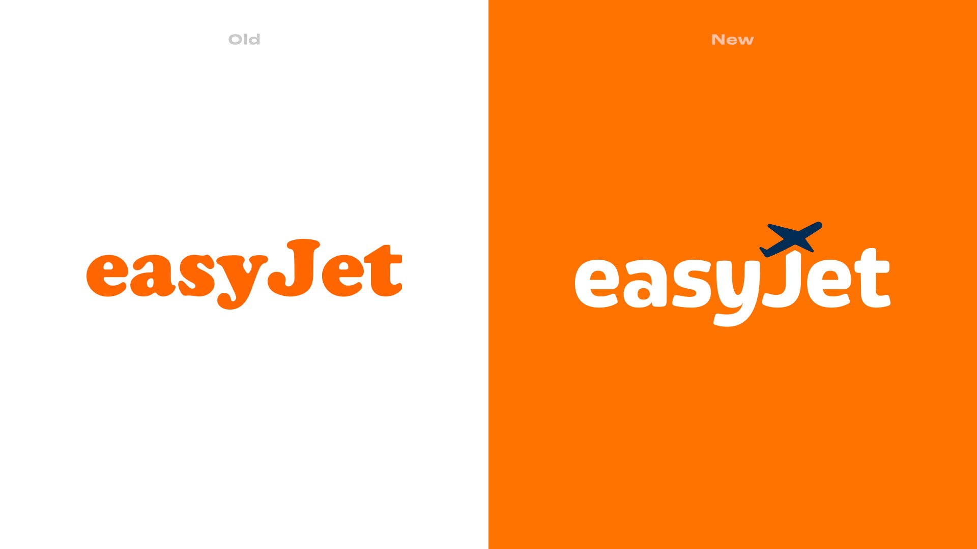
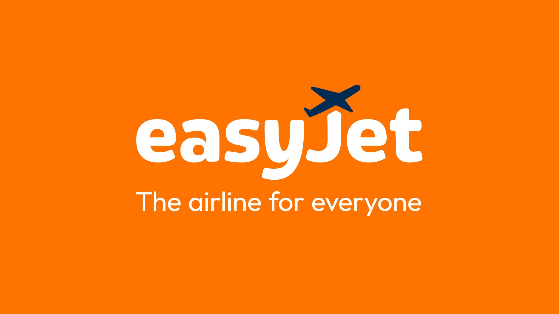
The logotype is the main cause for concern, feeling very much of its time with a font that has a kind of “default” personality to it, despite its soft, rounded serifs. My goal was to create something still soft, but more modern, clean and balanced. easyJet is a low cost airline, so I wanted to translate “cheap and cheerful” into “welcoming and friendly”. The addition of a plane silhouette over the ‘J’ adds a further injection of playfulness, and also opens up the possibility for a brand icon.
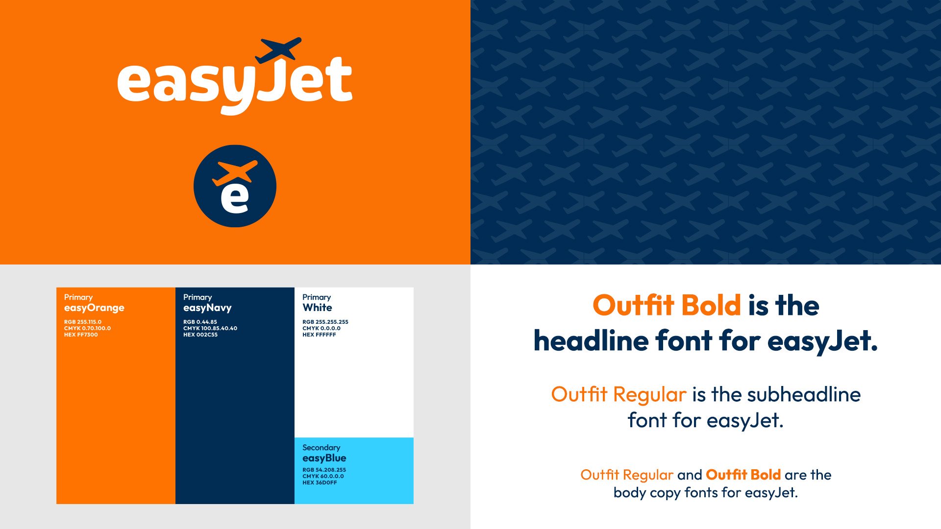
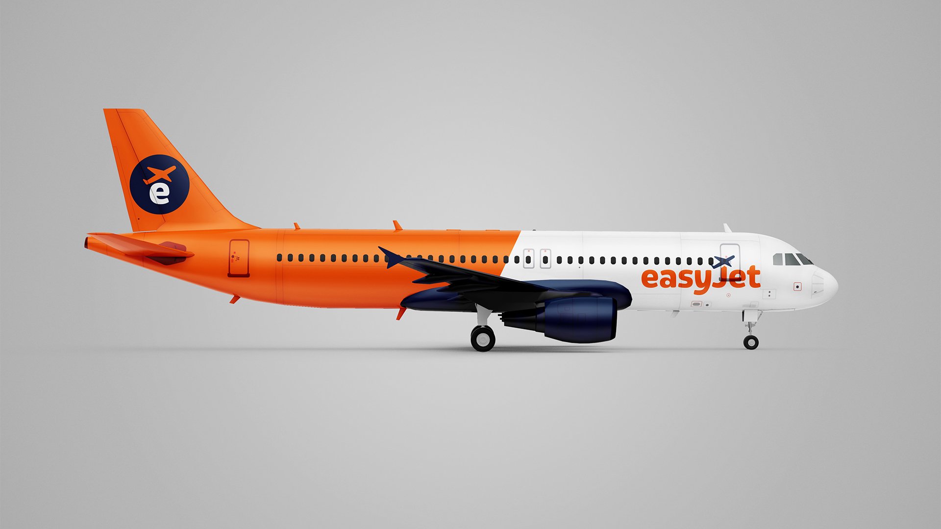
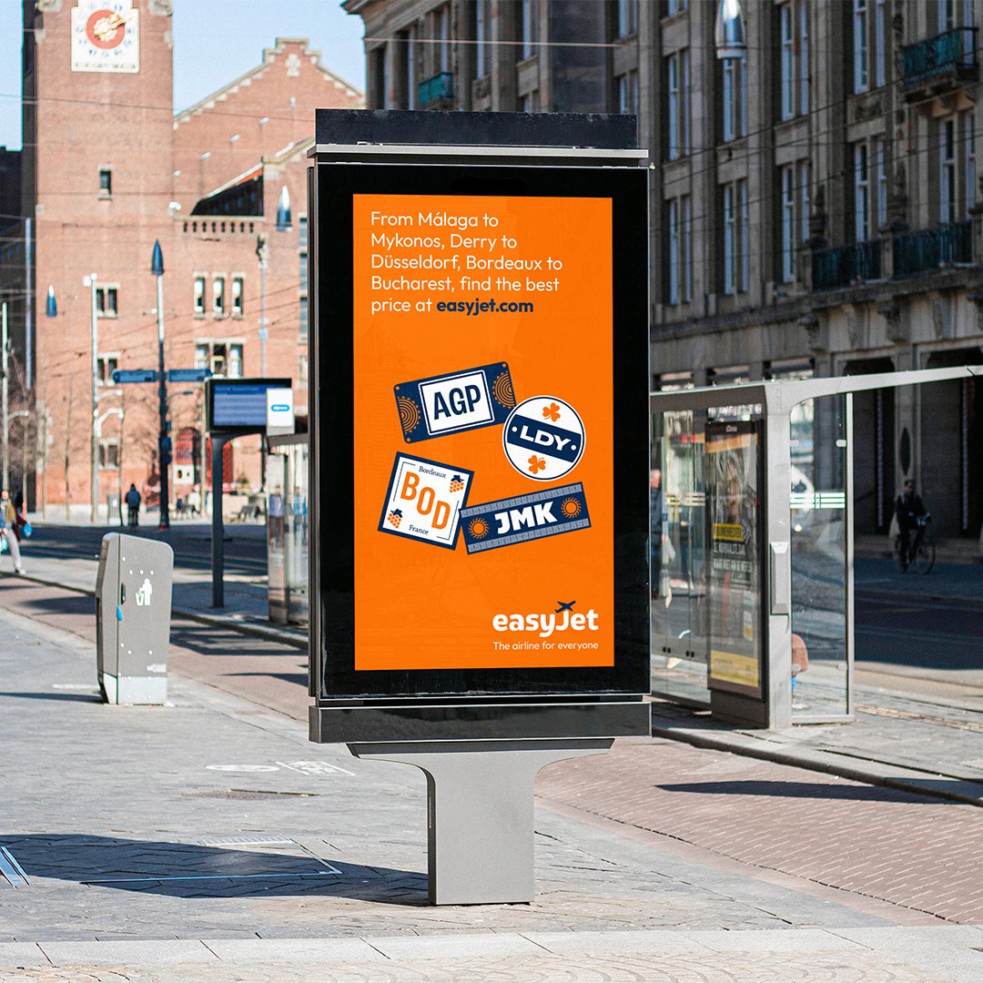
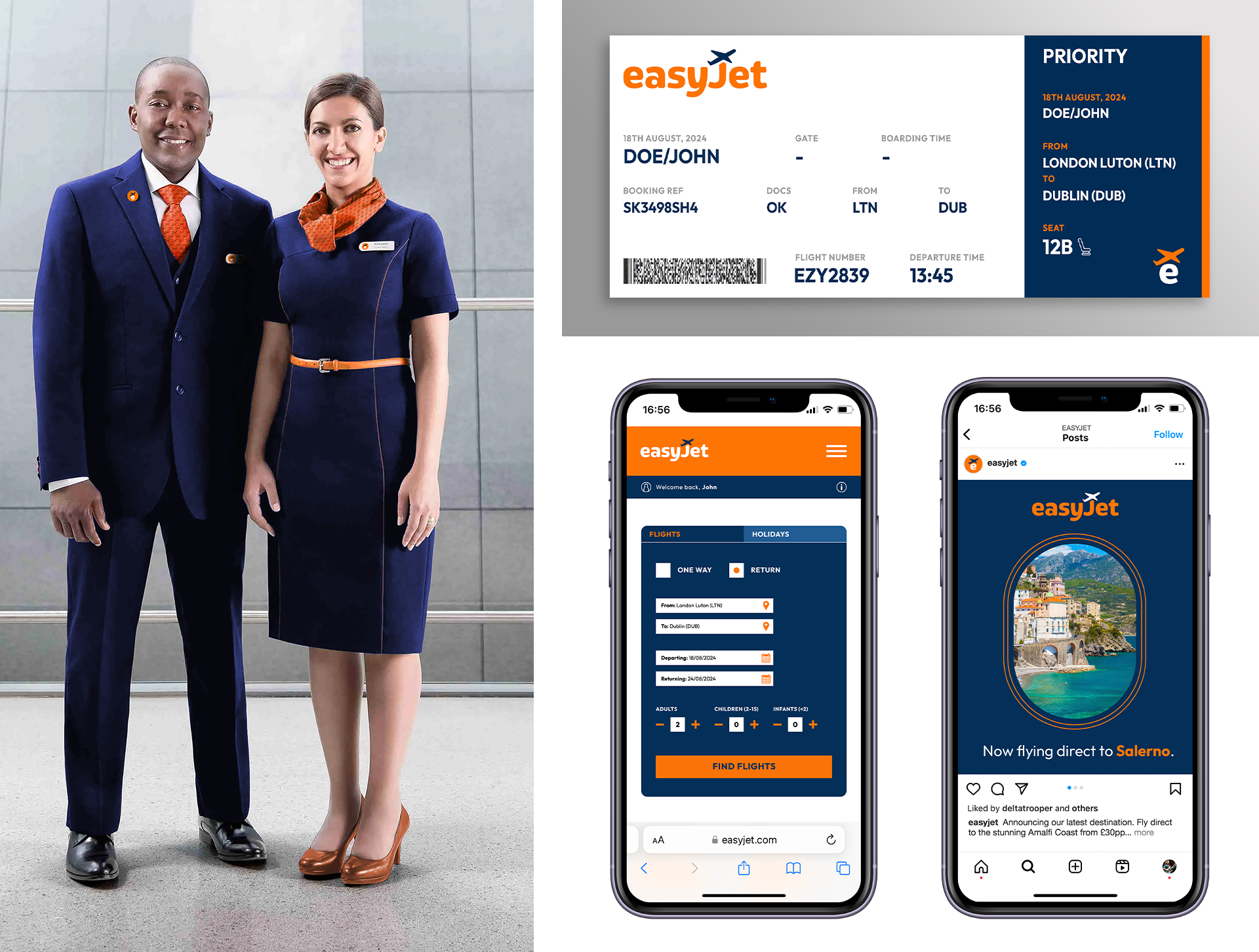
The aesthetic of the wider brand is intended to retain a strong sense of familiarity for the consumer, but overall have an exciting, contemporary, approachable yet slick look. The addition of things like a slightly expanded colour palette, a brand pattern, and a strong standalone icon opens up a world of possibilities for the brand and where it could go. Things can still just be stripped back to the bare bones though, with a focus on the orange and easyJet’s synonymity with this.