Monster Energy
Do I drink energy drinks? No. Does the appearance of a Monster Energy can, with that garish, horror-inspired ‘M’ eternally offend me? Yes. Maybe I’m not the target audience, but still, this presents a fun challenge for a hypothetical rebrand to bring this beverage with a die-hard following up to date.

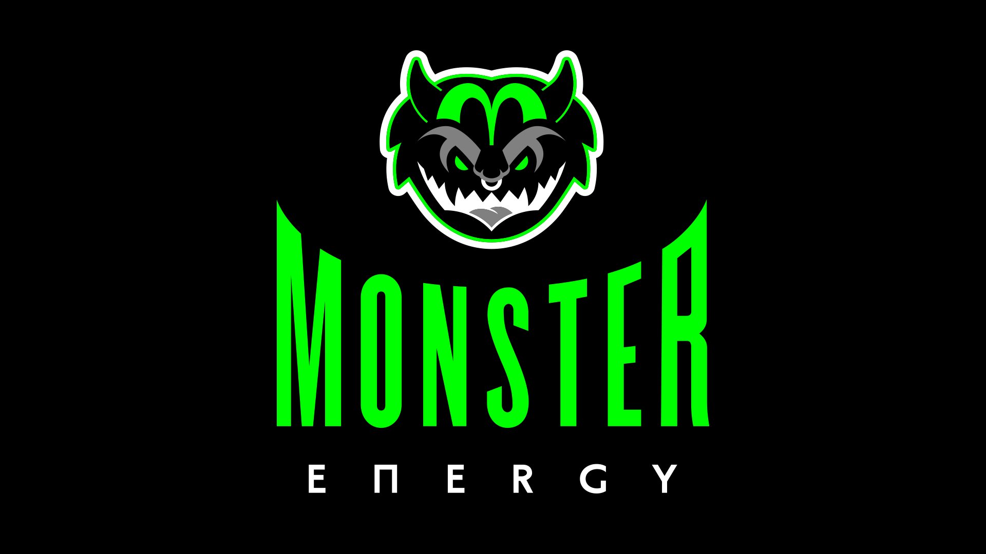
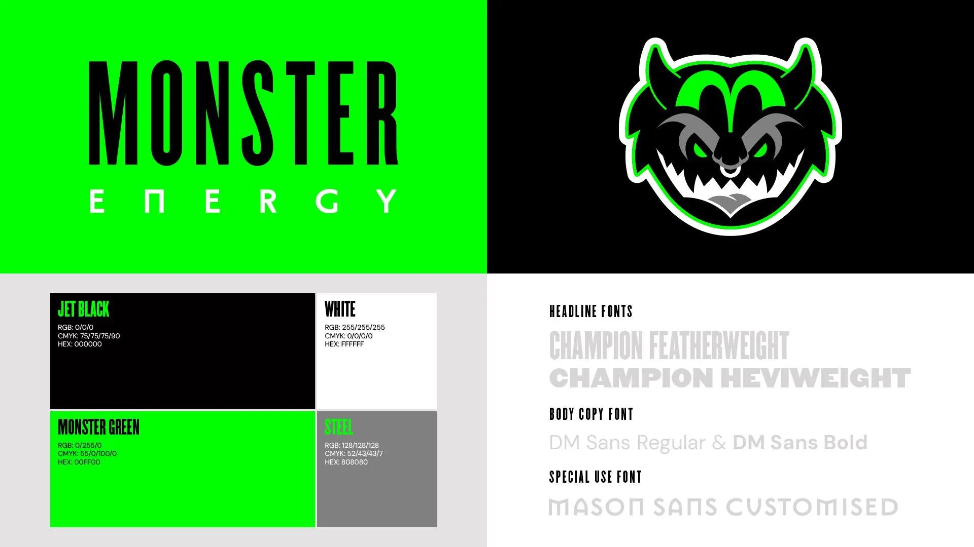
One thing that does work for Monster is their instantly recognisable use of black and green. I decided to keep this, but dialled up the vibrancy of the green to bring it into a more lime/neon space. The typography was completely revisited to feel more clean and modern, but still with a slightly dark edge. A new brand mascot was also illustrated to create an opportunity for the brand to have its own “monster” character.

Completely overhauling a brand that has such a cult following and a pretty iconic brand mark could be a risky move, but by taking inspiration from disruptors in the food and drink industry such as Brewdog, Prime and Huel, I aimed to create something that even the most loyal of Monster fans could get on board with.


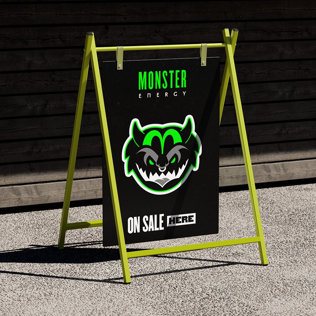
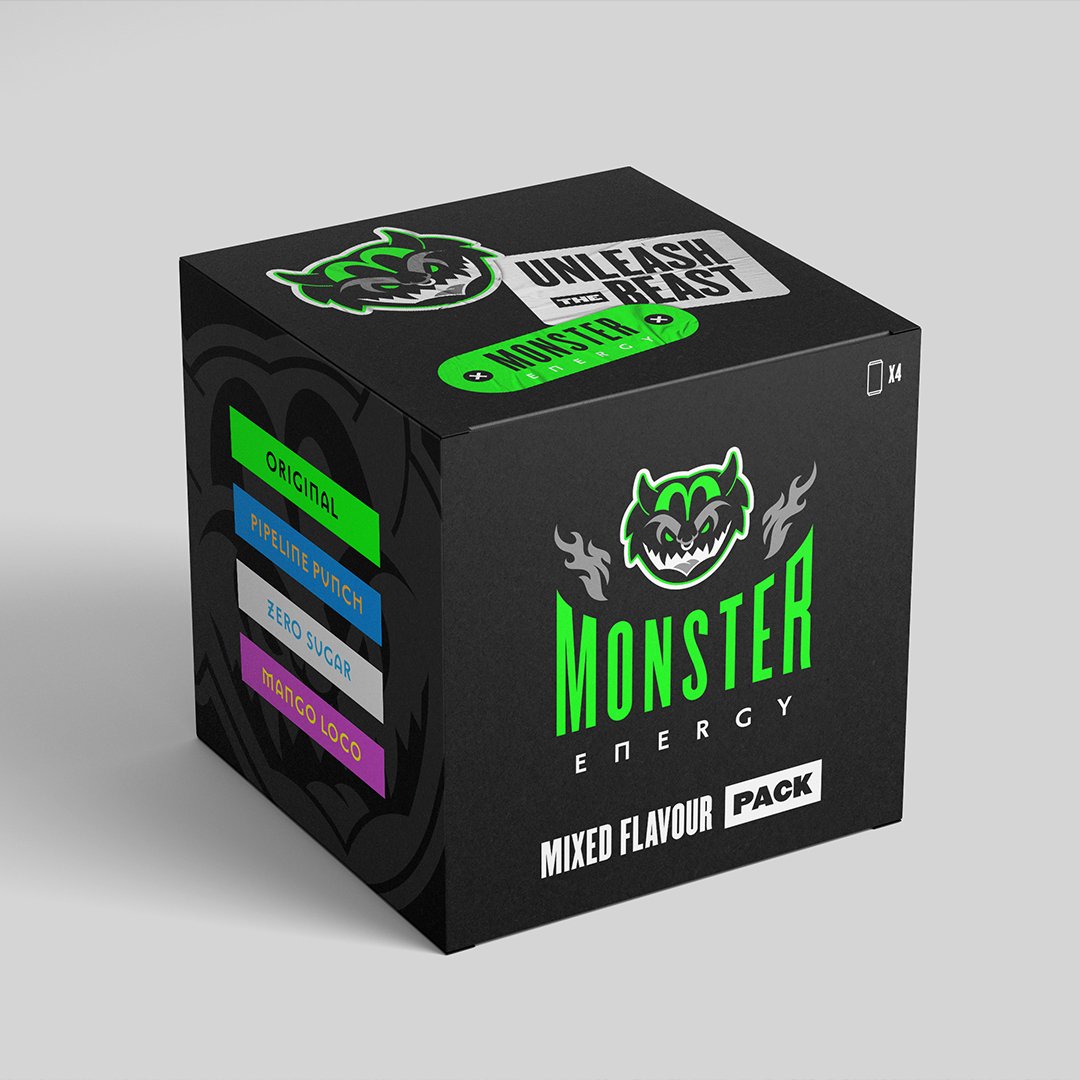
The wider brand aesthetic relies on bold typography and minimal design to create a product that stands out in a crowded marketplace. The design of the can is simplified, but uses the same colour identifiers for flavours so as to not alienate existing customers. The brand’s existing strapline - ‘Unleash The Beast’ - is also retained.


